11 June 2013

Real World Example: Signaling to bus driver to stop at night

While going for my daily walk a couple weeks ago, I noticed that certain bus stops now have a new feature that 1) enables bus riders to signal to bus drivers to stop when it's dark out and 2) subsequently for bus drivers to see that a certain bus stop has passengers. It's the first time I've seen this and although I've never used it I hope it serves its purpose well. The text describing users how to use it is clear. See the photos below.
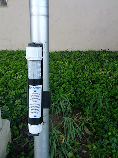


The one concern I have is if it's too dark for a bus driver to see a person(s) waiting for the bus wouldn't it also be too dark for a passenger to feel comfortable waiting in the dark for the bus?

31 December 2012

Update & Happy New Year

As you can see, I am no longer regularly updating my blog. I still plan to post thoughts on design and user experience as time or if time permits. For more recent thoughts if really interested, check out my twitter feed.

Happy new year everyone!
...and for my french followers...
Bonne Année à tous!

30 January 2012

Sign of the month: No fishing between arrows

Seen at the Santa Monica pier.
Note: there are no other arrows than the ones on the sign.

01 November 2011

Designing for Multiple Devices

I have been looking for a while for a specifications sheet for designing for multiple devices and today I've come closer to what I am looking for. Today's UX Magazine feature article lists common resolutions for different devices and offers some great guidelines for beginners on how to plan your design strategy when designing for multiple devices. The article outlines some great reminders for those

Here are three reminders that are not emphasized enough in my opinion:

  1. When possible, design for mobile first since the mobile environment offers the most constraints both real estate-wise and feature-wise.
  2. Make sure to identify the users' goals for each separate type of device (tablet versus smartphone versus PC, etc). The user's primary and secondary goals depend on the context of use of each device and therefor the users' goals need to be defined for each type of device. You might be surprised at what you discover!
  3. Design low detail wireframes then high detail wireframes followed by visual design mockups scaled to each screen size and containing the essential elements common across all devices types. This helps to create unity across devices in the early stages of design.
  4. Establish and document design style guidelines and patterns noting the specifications for each device type when the design differs because of constraints.
In addition to other tips, the article also includes a table comparing native mobile apps to mobile web apps. Check it out!